California Data Energy 2022
Data Source: US State Energy Data System
Outline Link to heading
Overview Link to heading
The goal of this final project was to visualize at least 6 variables in the dataset of our choosing. I used the US State Energy Data System and focused specifically on energy data for California in 2022. The following page dives into the design process for my final visualization.
Design Process Link to heading
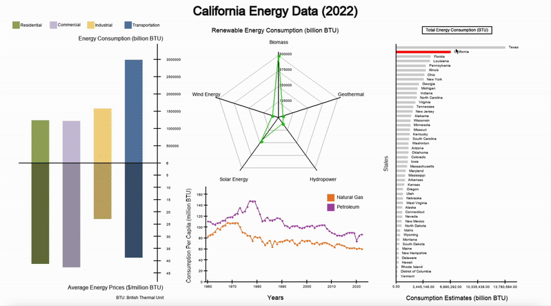
Starting with the very left, the visualization displays a bar chart, with the upper bar chart depicting the Total Energy Consumption by Sector and the bottom depicting Average Energy Prices by Sector. I intentially chose to make the lower bars a slightly darker shade to show that the bar charts are depicting two pieces of information for the same sector (identified by the hue). The upper and lower y-axis are also scaled to the data they represent: the upper y-axis has the units billion BTU (British Thermal Unit) while the lower y-axis depicts American Dollars per million BTU. From the visualization, we can observe that Transportation consumes the most energy while having the second lowest average price out of the four sectors.
In the upper middle, I created a radar chart to show California’s Renewable Energy Consumption in billion BTU. Surprisingly, California consumed a significantly greater amount of biofuel compared to the other four types: solar, wind, hydripower, and geothermal. I decided to use a radar chart because it helped to effectively portray the difference scales of consumption in a limited amount of space. I also chose to use green for the data points to tie in the concept that this chart was showing green energy.
The line graph depicts the trend in Petroleum and Natural Gas Consumption in million BTU from 1960 to 2022. The line graph shows a slight spike around the 1970s and 1980s, and then both fossil fuel sources begin to decrease steadily.
Finally, on the very right, an interactive, ranked bar chart shows California’s standing in three unique categories: Total Energy Consumption, Real GDP, and Energy Consumption per Real GDP. California’s bar is highlighted in red to make it more apparent among the 50 others shown (including the District of Columbia as its own category).
Takeaways Link to heading
Overall, this was a very educational experience about building informative, interactive visualizations from scratch. I went through a lot of sketches with pen and paper, from arrangement of different elements, color choices, and the narrative that a user would experience. Of course, there are many improvements that I could bring to this final creation that could improve accessibility and information availability, which I am learning to incorporate in other similar projects. I am extremely grateful to have had this opportunity to explore a design process from start to finish, and I am looking forward to seeing what other creations I can bring!
Acknowledgements Link to heading
This project was conducted during the 2025 Spring Semester of STAT198 at UC Berkeley through the College of Computing, Data Science, and Society. Special shout out to Sam Pottinger for sharing his love for creativity and informative science through data visualizations! Feel free to browse through the course website. Feel free to check out another one of my creations for this course at this page or browse through my GitHub repository!.